Let’s be real – it’s hard to impress someone online in the 21st century. With so many choices out there, at some point all websites start to blur together. And yet, for an ecommerce business, standing out is often what guarantees them success on the market. But how to stand out in a good way? Don’t worry, we’re here for you. After carefully looking at different good and not-so-good attempts of various online stores to differentiate themselves, we collected ten biggest trends in ecommerce web design in 2022.
Without further ado, let’s start with our list!
We all expect an ecommerce website to look a certain way. So when you break these expectations, you naturally draw more attention to your store.
Through unconventional layouts, some businesses try to convey their brand story, add new functionality, or structure the information in a new way. If done correctly, this will make your website look like a curated art gallery with visitors wanting to explore every part of it. As a result, you get more engagement, longer sessions, and higher brand retention.
Some ideas to experiment with:

One of the most popular ways to implement an asymmetrical design is a multi-directional layout. To make your store stand out, add an ability to scroll left, right, or diagonally, make elements bigger or smaller. This gives your store a modern and sophisticated look, and makes the experience more engaging.
However, when making changes like these, be very careful. Traditional layouts are popular for a reason, so you don’t want to disrupt the user experience too much. This change is definitely something that
should be done with expert help.
The vast majority of websites have their menus located somewhere out of the way, usually above the header. However, recently navigation placed in the middle of the page has been gaining more and more popularity.
The reason for this is a surge of customers using their smartphones to shop. The easiest areas of the screen to access are located right in the middle, while the header or footer of the website can be harder to reach. So putting the menu in the center makes it easier(literally) for mobile users to navigate websites and make a purchase.
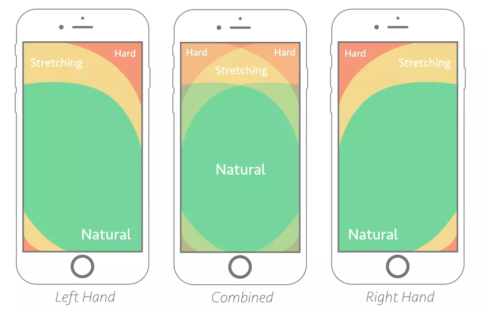
Targeting mobile users is essential because more and more people make purchases online from their smartphones. Mobile commerce already makes up more than 50% of ecommerce sales and is expected to see an additional 24,5% growth by 2026.
It also has a generally positive impact: this kind of navigation makes it easier to find what you are looking for and encourages quicker purchases.
You don’t have to completely remove a menu from your header. Some websites combine them, keeping a traditional menu at the top of the website, and adding a second menu in the center for the most popular categories or products.

Another way to transform traditional menus is to arrange them vertically. This is another result of mobile shopping becoming more prominent since some horizontal menus don’t work well on narrow screens, even if the website has a responsive design.
A vertical menu doesn’t take much space and is easier to scale, so it adapts to different screens way better. Also, such menus allow you to focus on visual storytelling.
When viewed on a desktop, a vertical menu doesn’t obstruct the content of the website with drop-down categories.

Usually, vertical menus work best for stores with a smaller number of categories or products. Bigger menus arranged this way tend to overpower the page with its contents, so using them is not ideal. Vertical menus also work amazingly well for landing pages, serving as a guide to your website for your customers.
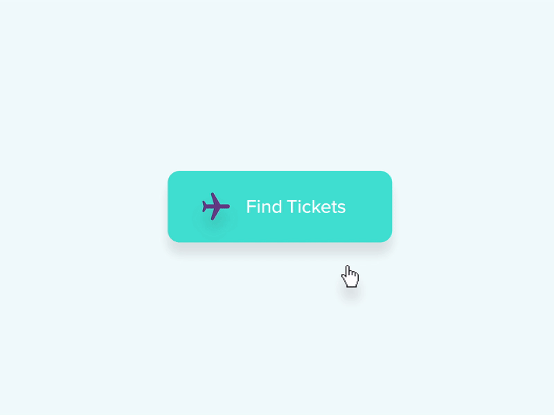
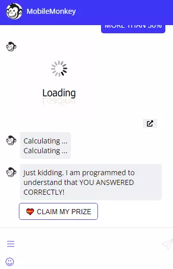
Micro animation (or microinteractions) are brief animations that can be used to explain things visually, bring attention to an element, or signify to users that they have performed a task correctly. It can also make a website less visually boring, or add character to your design.
Here’s one example of microinteraction, made by Mauricio Bucardo on Dribbble.
By making some processes more visual, you give a more engaging experience for your consumer. For example, using animation on a loading screen while page loads can make a website more interesting to look at, and also signify to the visitor that the loading process is still happening and the web page didn’t freeze.
Another popular way to use micro animations is to animate a CTA (Call To Action) button on click, add a ringing notification bell that reminds the visitor to sign up for notification or newsletters, or use various loading animations.
Dark Mode has been getting more and more popular in recent years. There are many reasons why someone might use it: it reduces glare, limits blue light exposure, and even saves battery life.
How so? OLED screens turn off the pixels when they show fully black color, and as a result, they draw no power. This trend is perfect for targeting smartphone users since most new smartphones come with OLED displays.


While it’s common for social networks and news websites to have a dark mode, ecommerce is one area where it is not super common yet. Why not use this to your advantage? Not only will it make your website easier on the eyes (especially at night), it will also visually stand out from your competition.
You can make your whole website have a black background, or have a light and a dark version of the same design that users can choose from. In any case, your customers will thank you.
Chatbots and AI are nothing new in 2022. However, with each passing year, they are getting more advanced and involved in the selling process. Well-made bots can boost your sales, and save you time and money. Here’s how:
You can also use your chatbot to tell more about your brand. It’s a given that your bot should have natural and grammatically correct responses. But what if a personality to it? If your bot will talk with your brand’s tone of voice, or in your target audience’s manner of speech, sparingly make jokes and use emojis, it will be memorable for your clients. This way, you can continue expanding on your brand’s story and personality even in this small channel.
This is more of a technical side of web design, but still worth mentioning.
Headless commerce is an approach in ecommerce development that allows companies to make their stores more agile and flexible by separating various user interfaces (front-end) from the server side (back-end). As a result, it allows the front end and back end to function more independently, and you can customize your store without having to make changes to the back end.

Headless commerce is great if you want to implement any other trend we’ve been talking about here: AR/VR, interactivity, and other things. As each component can be edited independently, you can make all changes much quicker, which means you can adapt to changes better, and, as a result, serve your customers more effectively.
By the way, if your store is running on Magento or Shopware and you want to implement headless commerce, we’d be glad to help you! Contact us for more information.
This trend goes hand in hand with many others we’ve been discussing today. If there’s anything to get out of this article, it’s this: people like to play around and be entertained, even when shopping. This means any interactivity or unusual feature will be well received unless it breaks customer experience.
For this reason, interactive pages show better engagement rates and better customer satisfaction levels. And the best thing is, there are so many different ways to make your website interactive, there’s a solution for every type of product, and every budget.
Some of the things you can do:

For example, take a look at AirPods Pro page on Apple’s website. Apple uses interactive design to showcase their product, convey the feeling of using it, and make a bold design decision that is sure to be remembered by their clients.
Another layer to this is Augmented Reality. AR, if done correctly, can significantly enhance a shopping experience. For example, IKEA allows its customers to virtually place a product in their room and see how it looks, and if it will fit in a given space. For companies that sell makeup, a popular AR feature is applying chosen makeup products to clients’ faces on a photo.
Well-thought-out search filters make your customers’ lives much easier, especially if your store is on the bigger side. It is also one of the most used functions of any ecommerce website. So why not use it to make an impression on your customer?
Adding something extra to your filters is a good way to make an impression on the visitors of your website. Showcase your personality through it! Add a pinch of humor, make it an interactive experience, or make the filters look more visually appealing. This will raise the engagement, as customers will want to play around with the filters, and, as a result, their visits to your website will be longer.
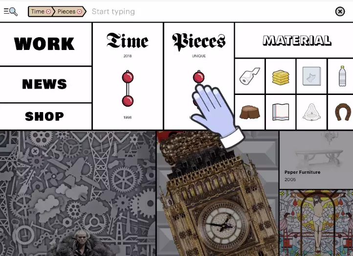
However, this is another trend you have to be careful with. While trying to add originality, don’t forget about the original function of search filters: they help your clients find what they are looking for faster! The process should still be logical and easily understood, otherwise it will only annoy your customers.
As you see, there are many different ways to stand out against the competition in 2022. With such diversity of choice, we are sure there’s something here you’ll be able to apply to your business, no matter what your budget is, or what you are selling.
You don’t have to go all out with this if you feel that your brand is on a more serious side. Still, even a few smaller changes here and there can make a big difference.
Also, don’t forget that all of this shouldn’t impact the actual functionality of your store. The shopping process still needs to be fast and functional, or even the trendiest website design won’t be able to help you.
And finally, if you already have some changes in mind, reach out to us! We specialize in Magento and Shopware development and would be very happy to help you.