Competition in ecommerce is at an all-time high right now. Every year, more and more customers will turn to the Internet to make their purchases, and more and more companies will want to sell their products online.
To not only survive but prosper in such a competitive environment, your store needs to be in top shape.
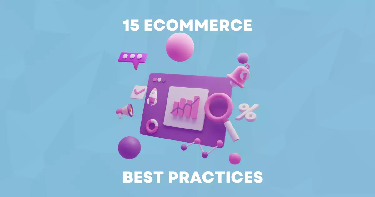
In this article, we collected 15 best practices for an ecommerce store. They encompass different areas, from marketing to development to UX and design, to make a list more comprehensive.
See if your store adheres to all of them. If yes, amazing! You can switch to more advanced improvements. If not, now you know what areas to work on.
So, let’s get to it!
Having your store load fast is vital. The influence of loading speed on customer behavior has been a subject of numerous studies. Research conducted by Google showed that a 4-second delay in loading speed causes 25% of users to leave a desktop site. For mobile users, the numbers were even more dramatic: 53% of users left if a website took more than 3 seconds to load. For ecommerce specifically, a 1-second delay reduced customer satisfaction by 16%.
Even if you think your store loads fast, it’s worth checking again. Also, just because it opens quickly for you doesn’t mean it will open as fast for everyone else. The type of the device and the location all influence the speed.
To know how your website loads, you need to use external services, like GTMetrix or Pingdom. They will show how fast your store loads for clients with different devices in various locations.
If you find out that your store is too slow, it probably needs some optimization. Many things can influence website speed: your hosting, the platform you choose, the plugins you have installed, and so on.
For the Magento users, we wrote an article about improving Magento 2 loading speed that looks at what you can improve in greater detail.
If you are in the ecommerce business, you have probably heard that a website should be easy to navigate many times. But what does it mean? Let’s figure it out.
Firstly, people generally read the information on a website page in an “F” pattern. Use this rule to decide where the most important elements should go. In most cases, the categories, search bar, and promotional banners are located on top of the page and on the left side for this reason.

Also, your clients will expect certain things to be in certain places based on their previous experience. Generally, try to position every element where it usually is in other stores. If you absolutely need to move it to a different place, make sure to add extra pointers to your customers, so they know where to find it.
According to a study done by HubSpot, 76% of consumers say that the main factor in a website’s design is “the website makes it easy for me to find what I want.”
Clear categories are a must if you want your clients to feel comfortable using your website. They have to be descriptive (so don’t use flowery language or professional jargon) and easily findable.
If you have many products, consider adding a filtering system.
A search bar helps improve the customer journey further. If you only sell a few items and all of them can be shown or reached from one page, then you may not need a search bar. But in every other case, it is essential. Make sure it is easily findable and available on every page.
The only exception to the rule is the checkout page. Any distraction there leads to a higher cart abandonment rate. For this reason, it should be as uncluttered as possible, so it doesn’t need to have a search bar or a menu.
Another useful tip is to put yourself in the shoes of your clients and try to find some products using the search bar and categories. If you have any difficulties, you need to rethink your strategy for dividing products into categories.
Breadcrumbs are another great tool to improve navigation. If your clients want to widen their search a bit, breadcrumbs are an easy way to do it. This encourages the visitors to browse more pages, improving both the number of sales and the CTR of your store. They are also great for SEO!
One place where many stores don’t use breadcrumbs (but really should start) is a checkout page. Adding breadcrumbs there creates a progress bar that allows your clients to see what actions they still need to take before their order is complete.

When a client is browsing your store, you don’t want anything to distract them. To achieve this, go for a clean and minimal design in neutral colors.
When it comes to the product page, make sure there is no clutter: Product name, price, description size and color options, photos/videos, and reviews are all you need. Everything else (like a FAQ section, or a bigger text for SEO purposes) can be hidden in foldable menus at the bottom of the page.

When customers visit your store for the first time without knowing about your brand, it can be hard to convince them to buy something. With so many scams online, users are wary of leaving their address and payment information and purchasing something without the guarantee the products will reach them.
Trust signals are a way to combat this. Essentially, they are evidence points that show customers that you are a reliable company that can be trusted to send out the product and keep their data safe.
First, let’s address the issue of security. Displaying your security badges is a quick and easy way to show your clients you take this matter seriously.
You can also add a page that talks about your security protocols in greater detail.
Another way to make your store look more trustworthy is by implementing user-generated content. Allow your customers to leave their reviews for the products to show the first-time buyers that others have already shopped here and are satisfied with your services.

Adding pictures of your products that your clients posted on social media (with their agreement) can also work great for this. With this solution, you achieve several things at once:
Many customers abandon the checkout process if it is too confusing or takes longer to complete.
If you can, create a 1-page checkout that’s easily understandable.
Many stores ask their clients to make an account to complete a checkout process. They make a big mistake. A 2021 Baymard Institute study found that 24% of customers abandon their orders because the website asked them to create an account. Offering a guest checkout is a great way to counteract that. If you want your clients to make an account, offer them something extra (like a discount on the next purchase) to motivate them.
To lower the cart abandonment rate even further, offer a product summary. A small window at the bottom of the page that shows the products, their sizes, and colors will assure your clients that they didn’t make any mistakes in their order.
Convenience is one of the factors customers look for in an ecommerce website. By providing different payment options, you make your store more convenient in the eyes of your clients and boost their satisfaction level. The go-to options are credit card or bank transfer, PayPal (and other local alternatives), Apple Pay, and Google Pay.
It also helps with the trustworthiness of your store since payment options backed by trusted companies (like Google or PayPal) seem more secure than entering card information directly into a store.
It is also worth considering “Buy Now, Pay Later” (BNPL) options, like Klarna.
If your store sells more expensive products (tech, furniture), it may be wise to provide payment by installments plan on your website.
Since more and more purchases are made on mobile devices, providing mobile users with a smooth shopping experience is a must.
There are many ways to make this happen: using a mobile version of a website, responsive or adaptive design, or by using a PWA. In our last article, we talked about Magento PWA and wrote about the importance of mobile-friendly designs.
General things that improve usability for mobile users are:
We think it needs no telling, but some stores still make this mistake.
Ads for other companies are a big no. The exception is ads done in partnership with a brand you sell. Use them sparingly and make sure they are developed specifically for your store.
In any other case, ads are a no. They lower customer trust, clutter the design, and distract your clients. Also, since many users use ad blocker extensions, the empty places instead of the ads will disrupt the experience. Any potential earnings you get by selling ad space won’t compensate for the loss of sales you’ll get.
A study done in 2017 showed that 89% of buyers start the buying process by searching for the product using search engines. And while this statistic is a bit outdated, this number can only grow higher. Unless you are a well-known brand, organic search is the way most clients will find your store.
If your store is not one of the first results for your target keywords, your clients will go to the competitors instead.
To prevent that, focus on off-page (links) and on-page (technical improvements, SEO texts, blogs) optimization of your store. It takes time and investment to move to the top of SERP, but it is so worth it.
A/B testing is a process of determining which version of a store or its elements is more effective in getting visitors to achieve a goal (like making an order, browsing a store for longer, or visiting more pages). You can A/B test everything from significant changes (like a completely new website) to the tiny detail (text on a CTA button).
Even if you don’t have any significant changes planned, testing small things can give you unexpectedly good results or an insight into how your clients think.
Services like Google Optimize are a completely free way to conduct A/B tests, but if you want to get in-depth information, there are other paid solutions as well.
Remember how we’ve talked about convenience being one of the most important factors for a website? Customer support is another element of that. For some, it is easier to call and immediately get information. Others feel uncomfortable making calls and would prefer to send an email.
When it comes to ecommerce, live chats show the most user satisfaction rates. Depending on your business, you can also combine them with chatbots.
Make sure there is a designated page that shows all available chat options and an easy-to-find FAQ section that answers the most important questions. It will help users feel more comfortable on your site and provide customer support specialists extra time to answer the more complicated questions.
Since your clients can’t touch or try on the product you are selling, they will be making a decision based on the images you provide. You have to be sure these images will make them want to buy the product you are selling, so make them as appealing and informative as possible.

Things to avoid:
If you can afford to, provide a video for a product. It can be just a simple interactive 3D picture or a full video review for more popular products.
Call-to-action buttons (like “Buy” or “Add to Cart”) are vital to the success of your store. Depending on where they are located and the design they have, they can boost or decrease your sales).
Ideally, the button should stand out from the design. Don’t go overboard with it: a flashing button that follows the clients while they scroll the page will only annoy them. But using a bright, contrasting color to what is already on the page is perfectly acceptable.
Your clients should receive a visual cue that the product was added to the cart after they click on a button: you can add a small animation or a summary of the order on the right side of the page.
Also, consider the words on the button. It has to be easily understood that the button is used to buy a product. For example, a button that says “I want this” is too confusing – are you trying to buy a product or add it to your wish list?
If you haven’t upgraded your Magento 2.x store to the newest version, or if for some reason you are still using Magento 1, it’s time for an update! Read more about how we can help you here.